The problem
Vogler sells hay, alfalfa, straw and bedding directly from a Swiss farm. Customers range from someone buying a small bag for a rabbit to a stable ordering by the pallet.
The product's quality is also difficult to show in a photograph. Dust treatment matters to animal health, but two bales can look identical even when their specifications and prices differ.
Constraints that shaped the work
Some buyers look for products by animal; others arrive knowing the material they need. Neither approach is wrong. The shop also has to explain very different quantities and delivery expectations in German, with prices in Swiss francs.
The customers generally know what they want. A visually elaborate shopping journey would add work to a repeat purchase.
Offer two ways into one catalogue
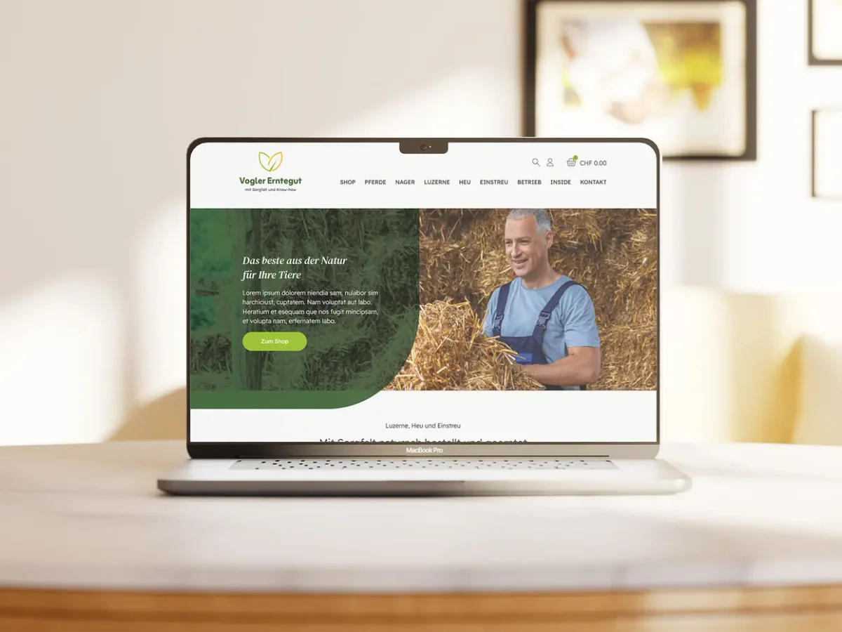
Animal categories and product categories lead to the same underlying items. Customers can start with horses or rodents, or with hay, alfalfa and bedding.
Keeping both entry paths adds navigation responsibility, but avoids asking either audience to translate its needs into the shop's preferred filing system.
Turn an invisible difference into a specification
Dust treatment is presented alongside weight and format as a comparable product attribute. This makes the premium easier to understand at the point of comparison rather than leaving it in supporting marketing copy.
Real farm provenance supports the story of the product. The interface lets concrete information do the work that generic agricultural imagery cannot.
Make quantity legible before the click
Product cards show format, weight and pallet options. This helps a small-order customer and a bulk buyer understand suitability before opening a product.
The cart and checkout path remains direct, with delivery expectations stated early. The design prioritises a practical repeat purchase over an extended browsing experience.
What I built
The documented scope includes eCommerce UX, UI and the responsive build. Catalogue architecture, product templates, cart and account flows, and bulk-ordering paths form part of that work. The shop is built with WooCommerce.
Outcome and further questions
Customers can enter by animal or product and compare the characteristics behind a price difference. Format information helps one catalogue serve both small and large orders.
The published account does not include a conversion or repeat-purchase measurement. Comparing how first-time and returning buyers use the two entry paths would inform future navigation decisions.